
Tuesday 13 December 2011
Cut Outs Series
This series is the beginning of communicating physical depth.
The cut outs originate from my drawings and I am beginning to contour the drawings themselves.
I do not see them as two dimensional, and will be working with projection and shadow work as well as layering to illustrate the physicality of the landscape.
The landscape beyond the surface.
The geology.
The history.


Tumult Series
Mappleton

The highest rate of erosion in Europe is on the East Coast at Mappleton.
The difference the sea flood defences made shocked me, and the cliffs were falling in to the sea as I stood there. The rate at which this was happening was unlike anything I have experienced before and inspired this series of work.
Soaking paper in buckets of water, using rotting paints, thick mud-like consistencies in some cases too.


Filey Series 2011
As artist in residence I am running a landscape module with the third years.
Part that, obviously, must involve them visiting a landscape, so Filey was chosen.
The images below and some of the work I have made in response to visiting Filey.
It is a landscape very much different to South Wales and am fascinated by the differences.


Flamborough Series 2011
Below are a few images of the new series of work.
They were inspired by a field trip to Flamborough, on the Yorkshire coastline.
I have begun introducing far more colour, though a monochromatic series runs parallel to all other drawings.


New Website
Hallelujah for faster internet speed!
My blogging has been atrocious over the past few months as I have had no way of updating my work... so here goes.
Firstly here is the new website - it is still in progress but I guess it always will be!
Monday 21 November 2011
Tuesday 15 November 2011
Been a while...
I have not long been back from Japan and have spent the week designing and painting the school drama set- A Christmas Carol nonetheless!
Some brainstorming:
I'm currently investigating my relationship with Wales, now being away from it.
Wednesday 21 September 2011
Artist Research
 Having relocated from South Wales to Yorkshire over two weeks ago I have be searching for connections. Communication is an essential element to moving from your family and the known to the unfamiliar and almost foreign. Whilst at Swansea Metropolitan University one of our tutors was Tim Davies who often uses postcards in his work. The artist's work above is not that of Tim Davies but reminded me of his work. However, rather than using other people's postcards and correspondents I would prefer to engage in my own. Contemporary communications prose a problem however. Facebook, e-mail, texts etc. remove the need for the physicality of ojects such as letters and postcards. Do I ebrace the new technology or revert to the traditions of the past in order to attain pieces I can document?
Jesse Treece:


Jesse Treece is a collage artist living in Seattle, Wa whose work screams of the simple, yet ever complex, interpretations of both the mundane and whimsical facets of life. He’s somehow managed to mix both the regular and absurd, beautiful and disturbing and put them into images that you find you could get lost in for hours. His tools of the trade include scissors, glue and vintage magazines/books.


Monday 19 September 2011
David Hepher
 Study for Wansworth Road Estate IV 2006
 Camberwell Flats by Night 1983
 Breughel's Tower (Diptych) 2004
"David Hepher's large-scale paintings, using concrete and photographic vinyl along with more conventional acrylic, convey the grids, textures and graffiti of a high-rise housing estate with great immediacy. Based on the Brandon Estate in the Borough of Southwark, they are at Flowers East, 199-205 Richmond Road, London E8."
"he has always painted buildings, David Hepher thinks of himself as a landscape artist. It just happens that buildings comprise most of the landscape he paints. He has a particular fondness for the better tower blocks of the 1960s, even when they are weathered with graffiti; and he singles out a group on the Wyndham Comber Estate near Camberwell Green in South London, 'built like a pile of bricks ... very chunky and squarish, a happy mix of brick and concrete'."
At university I attended a lecture and private tutorial by David Hepher and found him fascinating. His direct use of concrete on the canvas was inpsiring as it refers directly to the building material he is predominantly depicting. The multifareous layers engage the viewer along with the oscilation between expressive texture and graffiti and the precise, almost photographic, painting.
Thursday 15 September 2011
Susan Stockwell
 Made from used coffee machine filters.
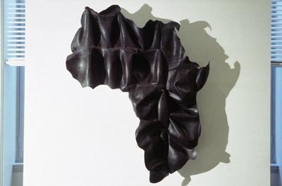 Made from rubber derived from Africa.
 Made from computer components - recycled.
 The simple use of line is very appealing.
 A Stitched blanket.
The project involved Susan worked with people from Lambeth Recycling Department, local volunteers and artists and together they made a quilt from discarded materials. The exhibition also contains a quilt she made about Florence’s life and travels using old £10 notes with pictures of Florence on them as the centre piece, a quilt made by inmates from Wandsworth Prison about Florence and the Crimea and a quilt lent by a private collector, made from Florence Nightingale Nurses uniforms.
She is a contemporary British artist. Her work addresses themes of technology, ecology, politics, identity and migration using her trademark motifs of recycled computer components and other everyday materials.

Simon Elvins


Silent LondonBlind embossed etching - 735x500mm - Edition of 10
Using information the government has collected on noise levels within London, a map has been plotted of the capitals most silent spaces. The map intends to reveal a hidden landscape of quiet spaces and shows an alternate side of the city that would normally go unnoticed.
Using information the government has collected on noise levels within London, a map has been plotted of the capitals most silent spaces. The map intends to reveal a hidden landscape of quiet spaces and shows an alternate side of the city that would normally go unnoticed.
Peter Dykhuis

Peter Dykhuis uses mapping throughout his work.
Social, geographical, linguistically, radar etc.
Maps, flags and state symbols abound in Peter Dykhuis’s art: “You Are Here” superimposes a map of Halifax on envelopes; “Radar Paintings” uses airport radar images; “World View: The G7 Suite” encloses maps from each country within their respective flags. Dykhuis wrote to say this about his site: “This site is an overview of artwork that explores the graphic, social and political contexts of maps and map-making in contemporary culture. Of major interest is the overlap between fixed, analog, paper-based maps and the fluid domain of digital mapping courtesy of satellite systems and 24/7 computer-based viewing.”


 Website
Typographic Maps accurately depict the streets and highways, parks, neighborhoods, coastlines, and physical features of the city using nothing but type. By weaving together thousands of words, a full picture of the city emerges. Every letter was carefully placed, taking hundreds of hours to complete for each map.
There is an engaging beauty about the use of words instead of conventional line.
Subscribe to:
Posts (Atom)